MediSafe
Medisafe helps seniors and caregivers prevent healthcare fraud by enabling trusted, two-way communication and simple billing verification within a major government healthcare program.
For
Deloitte
Time
Mar – May 2024
Role
UI design / UX design /
UX Research / Project Management
Type
Service Design / Mobile-first / Accessibility
The real risk wasn’t fraud. It was silence.
The problem space
Healthcare fraud succeeds when people don’t notice, don’t trust, or don’t know what to do next. In a major government healthcare program, many senior receivers are vulnerable because the system is hard to navigate, the process is intimidating, and communication often feels one-directional.
This creates a high-stakes gap: fraud can cost taxpayers billions and erode system integrity—but for seniors, the daily reality is simpler and more human:
- confusing notices and billing information
- long, discouraging reporting processes
- uncertainty about whether they’re being heard
- lack of clear, trustworthy guidance
So our goal was to:
Create a two-way communication loop of security and trust—helping seniors and caregivers review notices, verify billing, and reach support quickly and confidently.
Research that reshaped
our target and the strategy
Most of our team (including me) started with limited knowledge of the program, so I drafted an early research plan to ground the project: what we needed to learn, how we’d learn it, and how we’d translate it into design requirements.
We needed to understand
- seniors’ awareness of healthcare fraud
- where fraud enters the system
- current counter-fraud solutions and why they fail
- how seniors verify bills and respond to issues
- preferred communication channels and tech comfort
- what motivates reporting suspicious activity
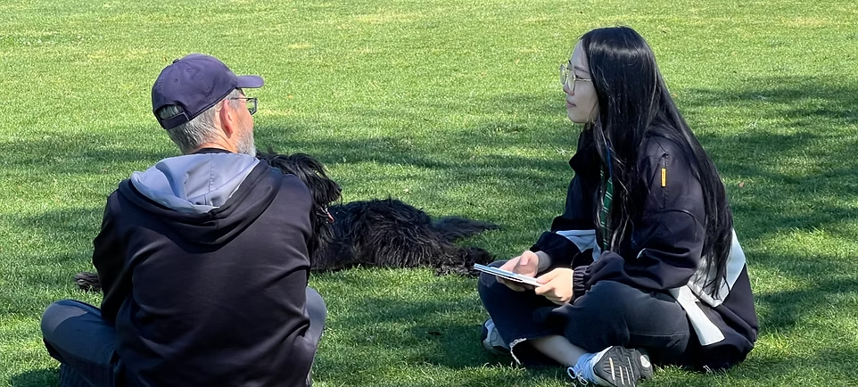
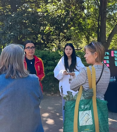
Methods
- Secondary research
- Survey (67 participants)
- Interviews: 6 in senior facilities (age 80+), 13 in public settings (age 65–80)
- Co-design workshop (30+ participants) In total, we gathered 300+ data points from 100+ participants.
A key pivot
After interviewing seniors 80+ in a nursing home, we learned many prioritize comfort and peace, and often don’t manage their own healthcare or finances. That insight shifted the project: we refocused on seniors aged 65–80 who actively manage their health, and we formally included caregivers as core users.
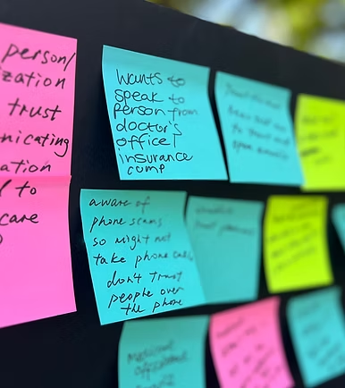
Key insights
- Seniors prefer direct, real-person communication
- Seniors are more digitally familiar than stereotypes assume
- Long processes discourage action
- Many have limited program knowledge
Core needs
- fast, accurate two-way communication with the program
- less burden while managing health and services
- trustworthy guidance that’s easy to understand
How Might We
- Encourage seniors/caregivers to review and respond to program notices and alerts
- Help them reach the program with a shorter, easier process when they need support or want to report
- Support understanding and engagement across complex program workflows
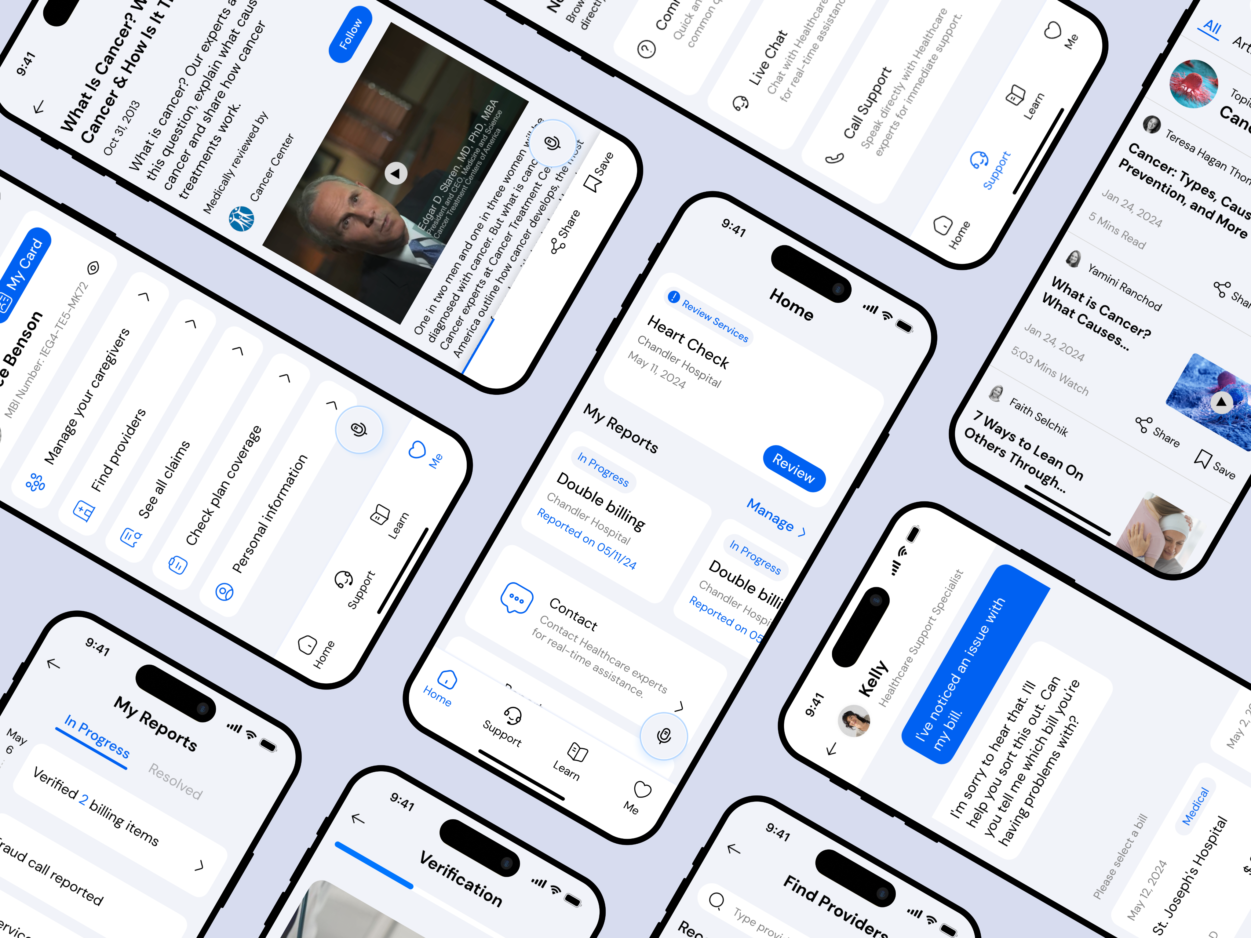
A mobile-first product designed for clarity, speed, and trust
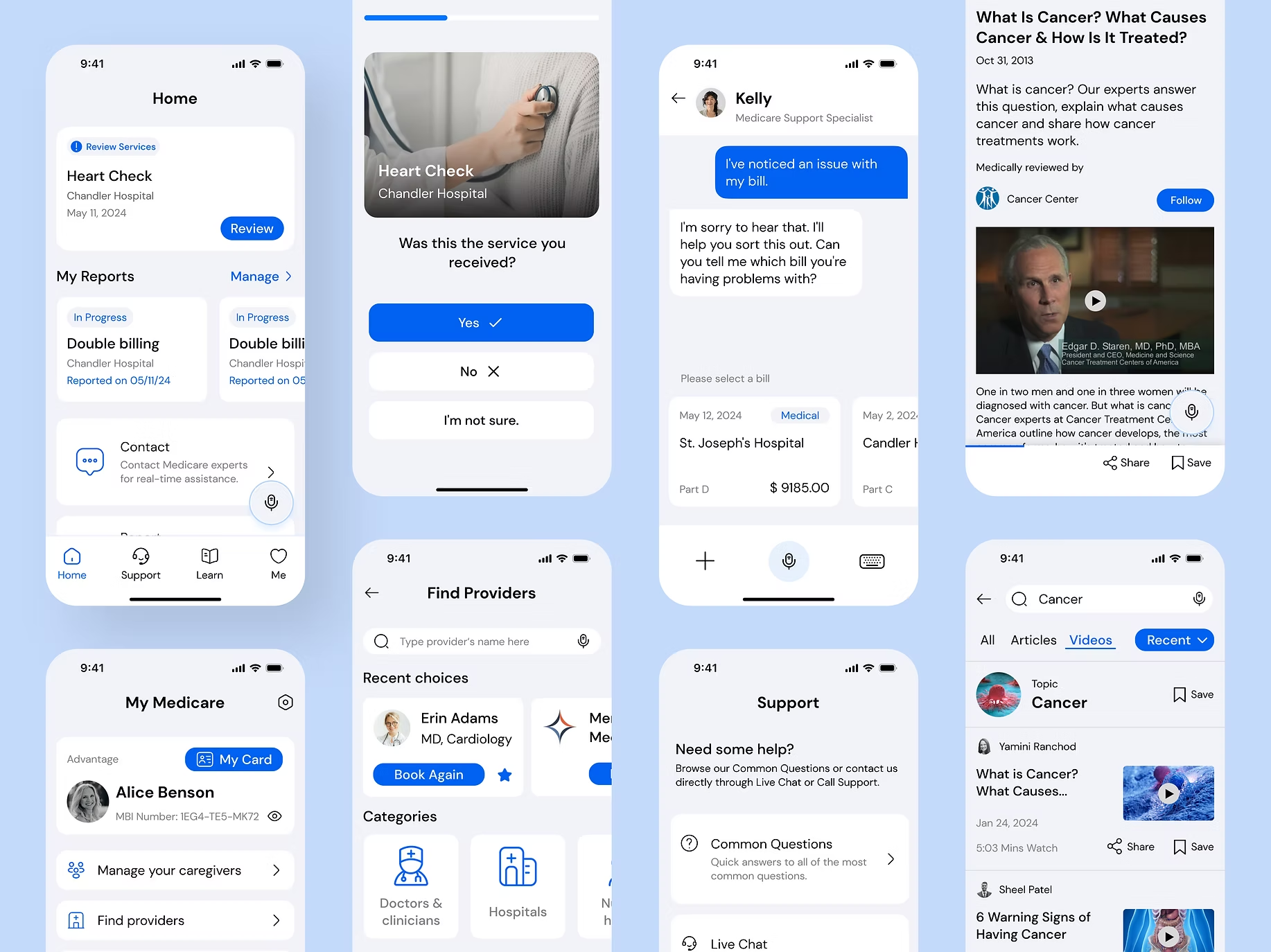
The product concept
Through research and client alignment, we chose a mobile-first direction because mobile supports multimodal accessibility (voice, camera, biometrics), faster resolution workflows, and easy extension to web and other channels.
We generated 80+ concept sketches, then converged on four core features that mapped directly to the HMWs:
- Billing management + verificationMake it easy to review notices, cross-check services, and spot mismatches quickly.
- Guided reporting + live supportShorten the path from “something feels wrong” → “I reported it correctly,” with real-time help.
- Education that reduces fear and confusionSimple, trustworthy explanations of fraud patterns, what to check, and what actions to take.
- Security + account managementHelp users feel protected and in control without adding complexity.
Shipping as a team of 17:
structure, alignment, and iteration
Leading a 17-person team meant the product could easily fragment. I set the timeline and quality bar, delegated responsibilities, and created weekly sync patterns to keep work coherent while letting specialists go deep.
Team structure
I split the team into four product areas—Home, Support, Learn, and My (Program)—with shared information architecture and design principles to ensure consistency.
My design ownership
In addition to owning the “My (Program)” area, I led two critical experiences that set the tone for the whole product:
- Onboarding + tutorial: essential for users who may need guided confidence with technology
- Interaction model: multimodal support including audio output and a voice-agent approach alongside touch and visual interaction to accommodate accessibility needs
Iteration and testing
We ran 2 rounds of testing across 4 iterations, including large mid-fi flows (180+ frames), and improved:
- UX writing and option labeling
- information hierarchy (what matters first)
- interaction clarity (what do these buttons mean?)
- caregiver visibility and transparency (who did what, when)
The pattern was consistent: seniors wanted fewer choices, clearer language, and stronger reassurance that the system is listening.
Accessibility-led visual design
and a system that stays consistent
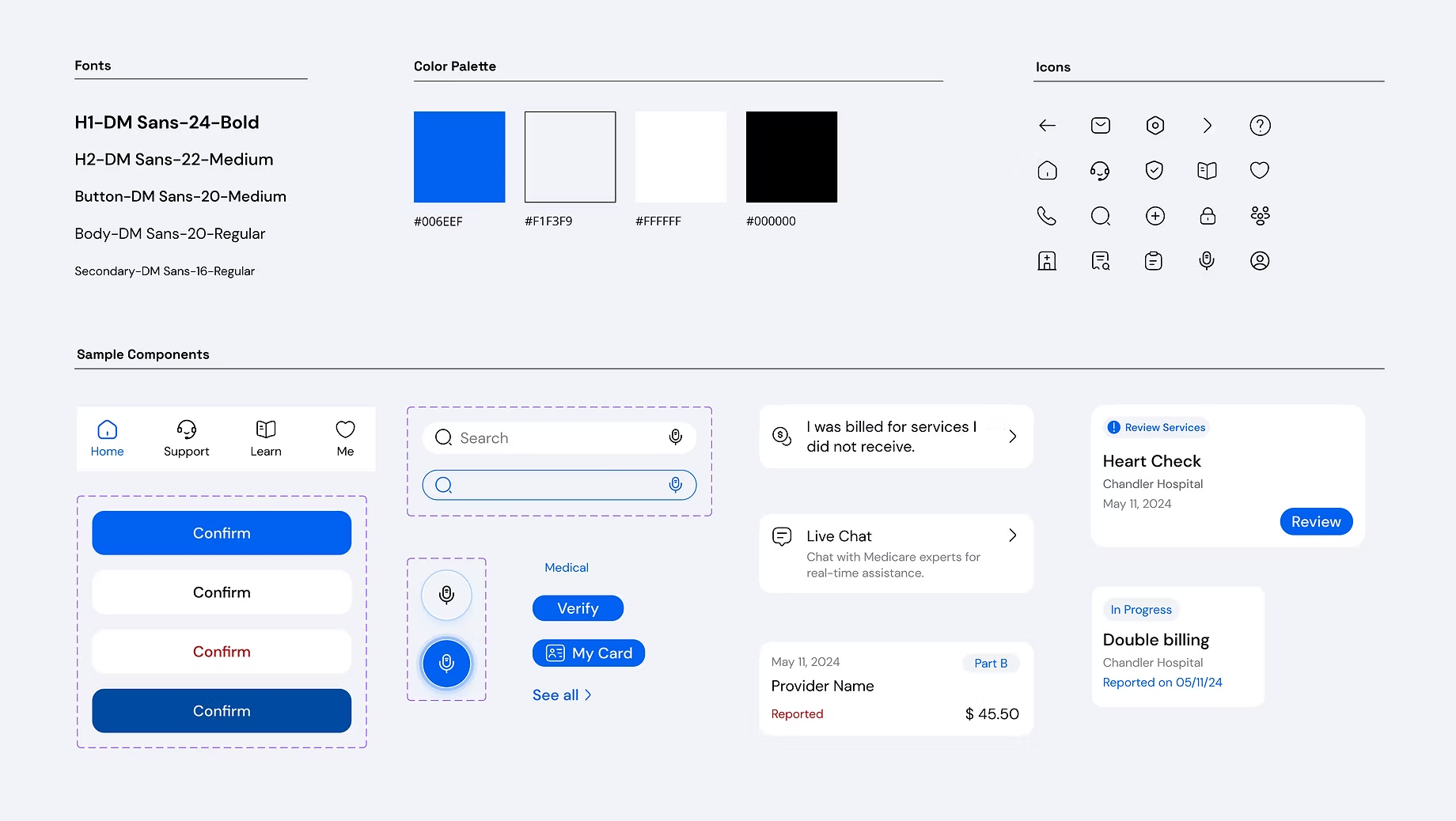
Accessibility as the north star
For seniors, visual design isn’t “polish”—it determines whether the product is usable at all. I led visual direction with accessibility as the primary constraint and simplicity as the aesthetic.
Accessibility decisions
- Typography: DM Sans for legibility
- Default font sizing set above standard, plus an easy text-size control
- A blue palette for healthcare familiarity, with all colors checked against WCAG contrast requirements
- Preference from testing: white components over toned backgrounds for clean, high-contrast readability and low clutter
Design system
To standardize output from 17 designers, I established a design system with colors, typography, iconography, and reusable components, so teams could move faster while staying consistent. The system was delivered to Deloitte for potential future use.
Outcome, reception, and potential impact
Reception
After 10 weeks, we delivered the final strategy and product design to Deloitte, and I represented the team in the client presentation.
Feedback from senior users, caregivers, stakeholders, and the Deloitte client was strongly positive, especially around simplicity, clarity, and the research-backed logic of the solution.
Potential impact
- Less fraudulent activity through faster, clearer reporting pathways
- Stronger security signals and a foundation for future detection/credibility systems
- Better engagement and awareness through accessible guidance and trusted two-way communication
The full research and design package was delivered to Deloitte to support end-client discussions across healthcare programs.
What I took forward
as a leader and designer
This project taught me that designing for trust isn’t only about security features—it’s about reducing uncertainty at every step: what I’m looking at, what it means, what I should do next, and whether someone is listening.
As a lead, I learned how to:
- set structure without stifling creativity
- keep a large team aligned on a shared bar
- resolve conflict early with transparent feedback loops
- represent work clearly to clients and stakeholders
Medisafe remains a proof point in designing for high-stakes users: when clarity, accessibility, and process design work together, people feel safe enough to act.