OKX Crypto Rewind 2025
Art-directed and designed OKX’s 2025 Crypto Rewind, a flagship interactive experience reaching 1M+ users with high engagement.
For
OKX
Time
Winter 2025
Role
Art Direction / Visual Design / UI Design
Type
Annual Report / Mobile
From Data to A yearly ritual
How we transformed an annual data report into an emotional, shareable ritual
What Crypto Rewind is
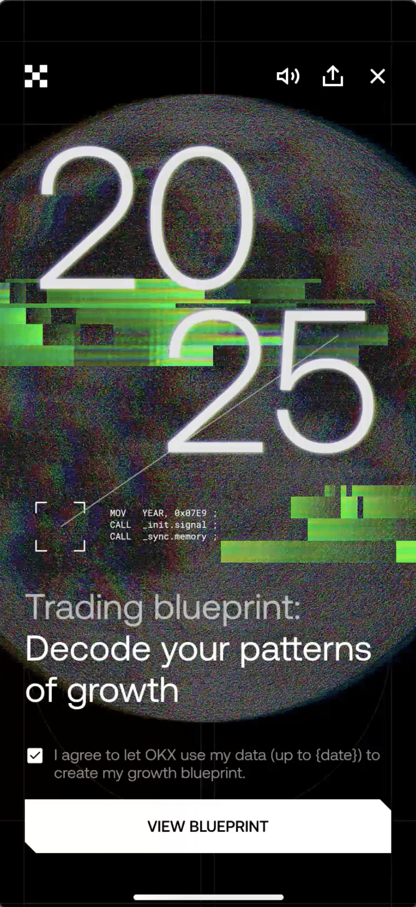
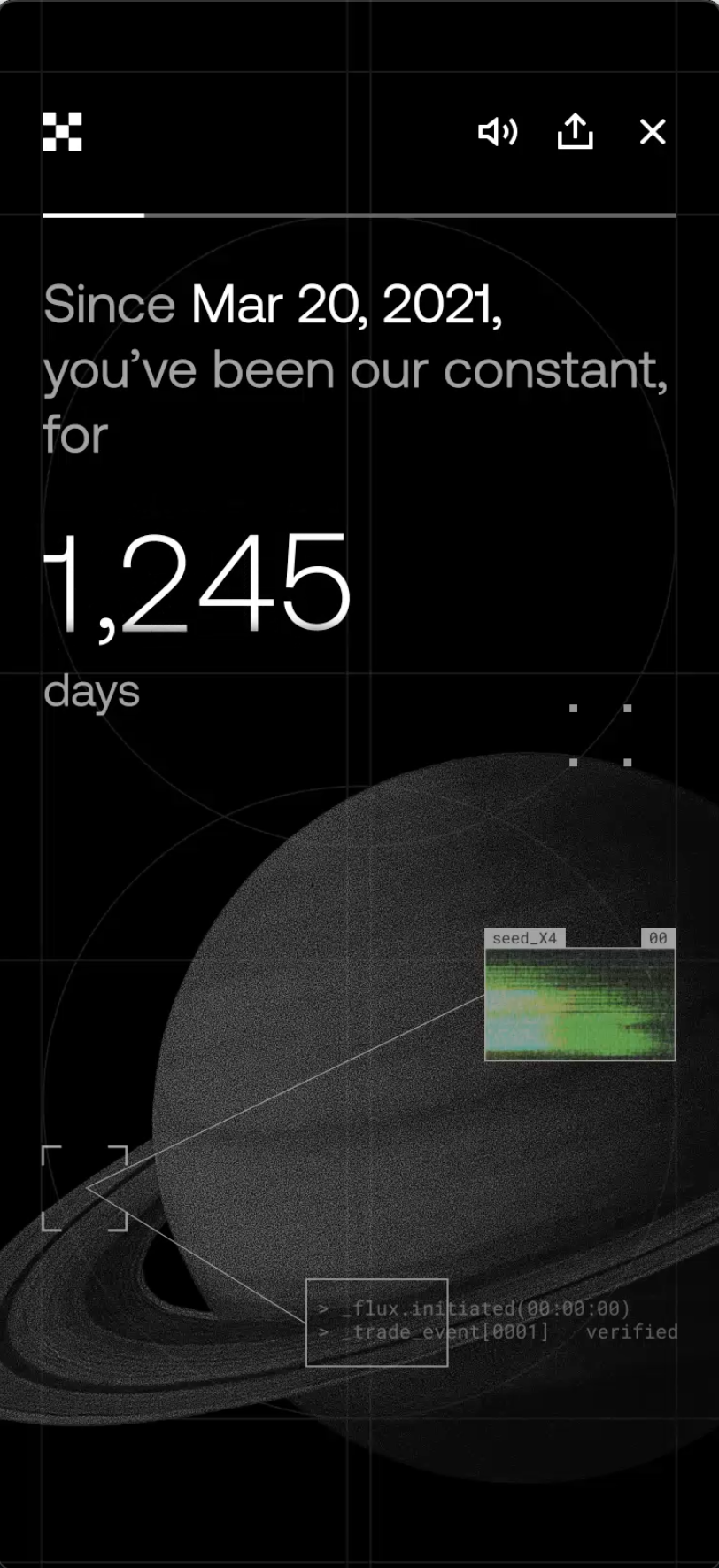
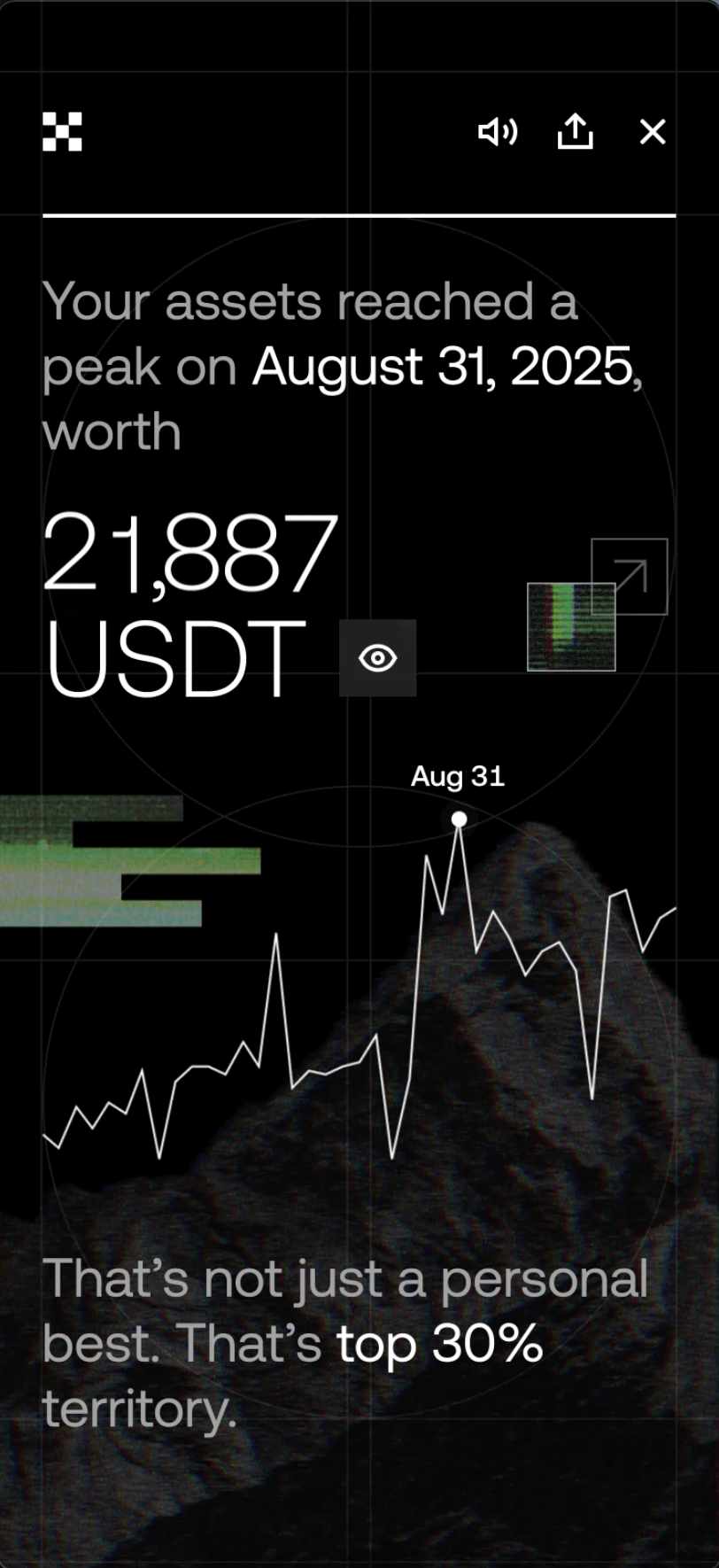
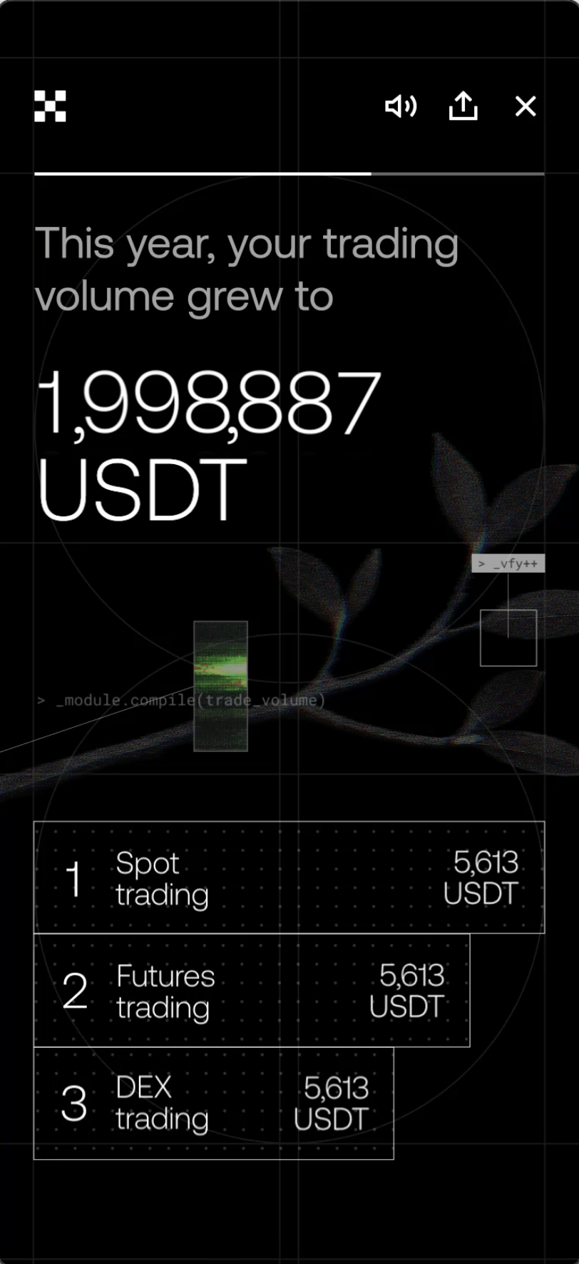
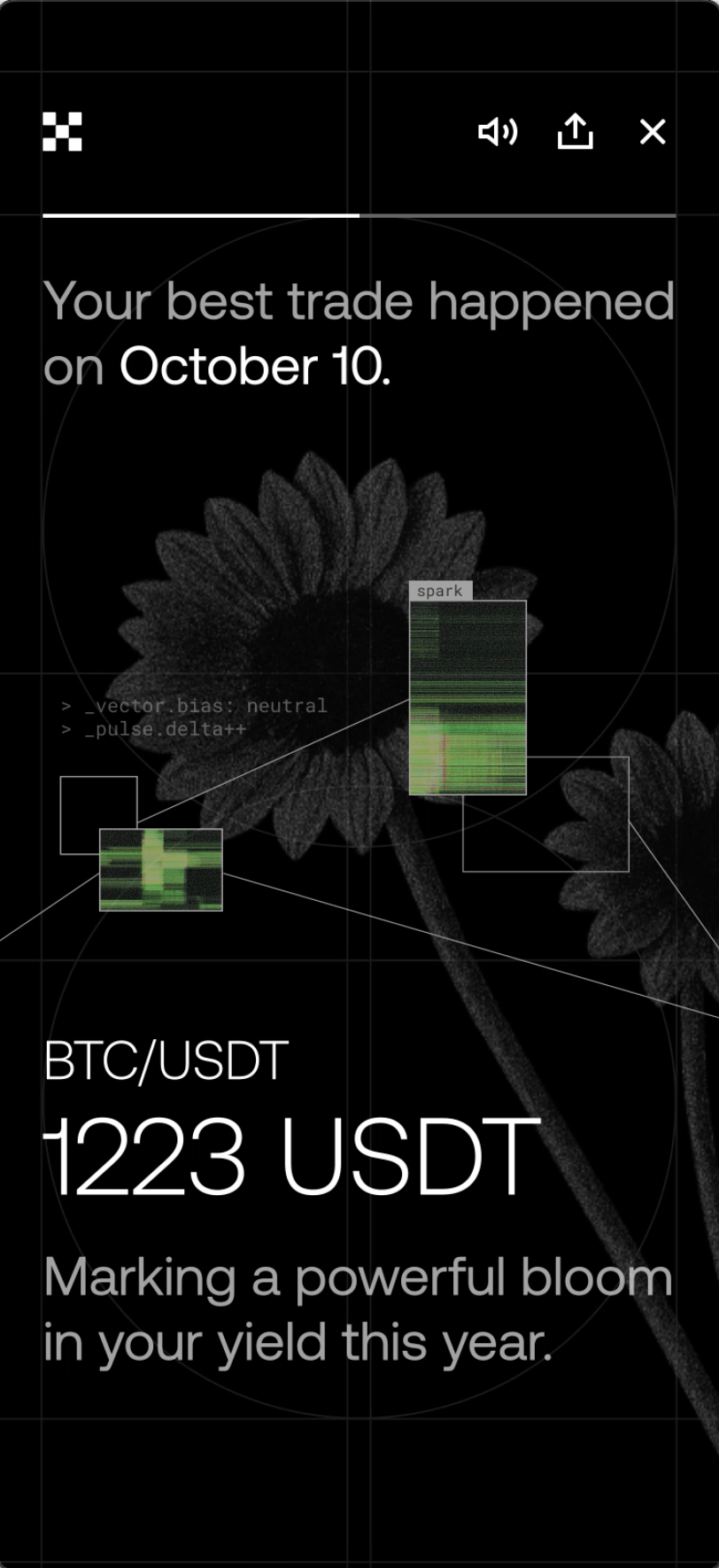
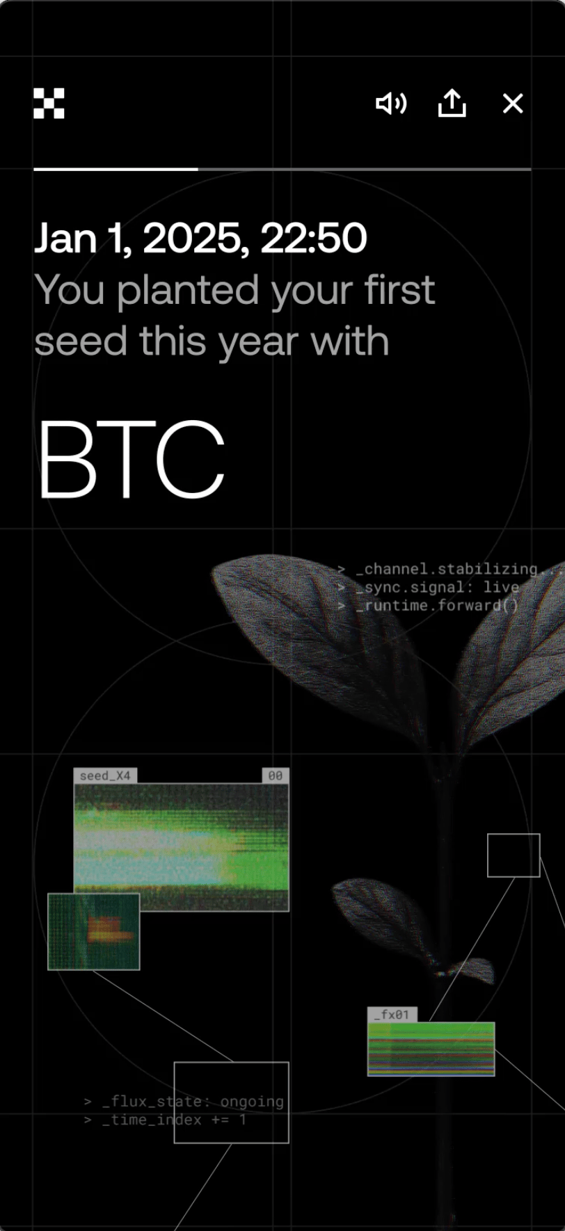
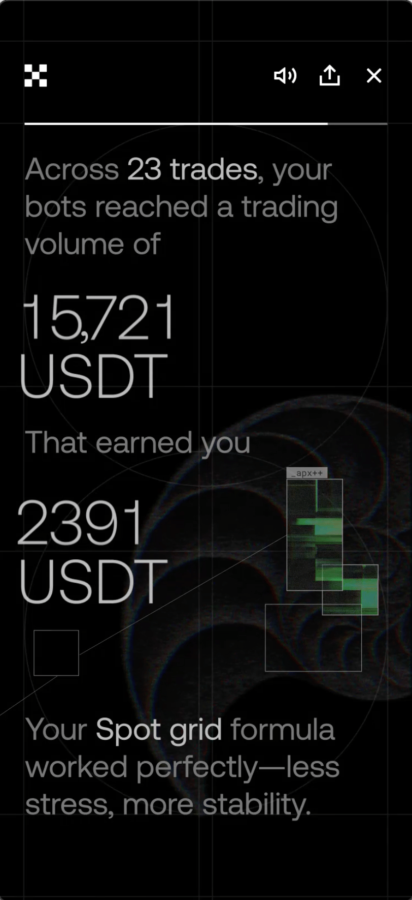
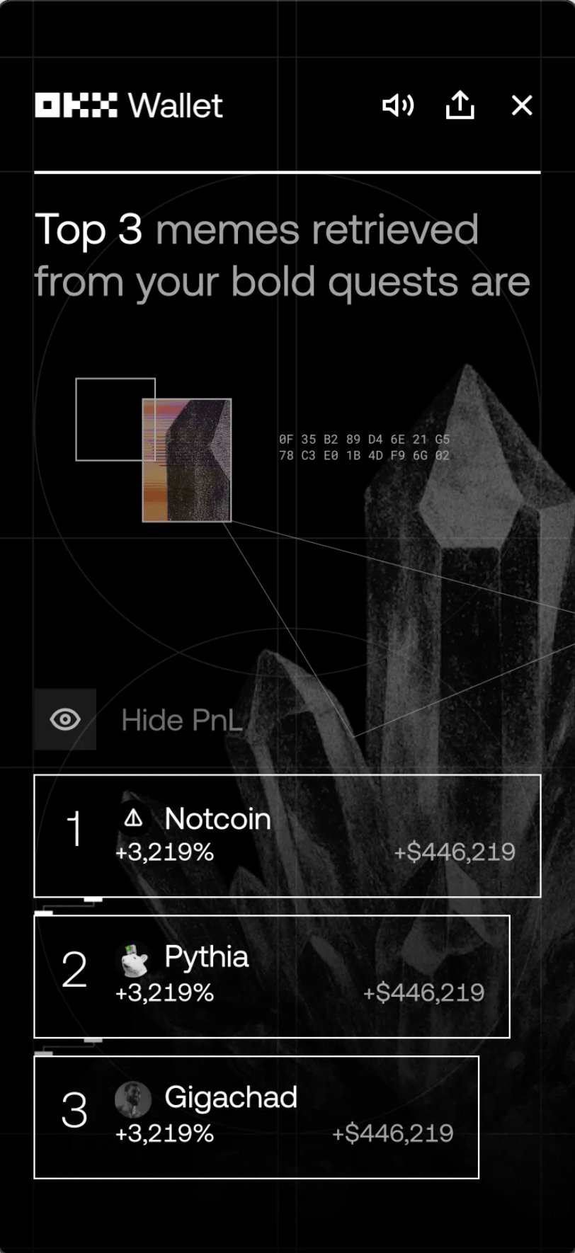
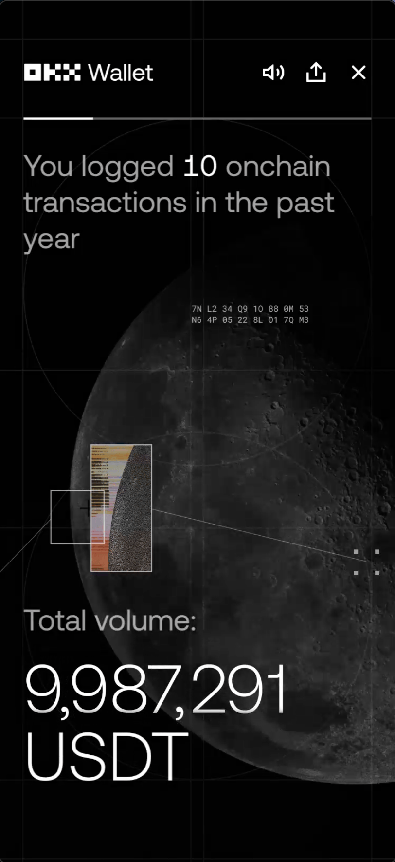
Crypto Rewind is OKX’s Spotify Wrapped–style annual recap for both the OKX app (CeFi) and OKX Wallet (Web3). It turns a year of activity—trading volume, assets, tokens, milestones, and behavioral patterns—into a guided story users can scroll through, save, and share.
What we shipped in 2024
— and what it taught us
The 2024 edition established a strong premium baseline: a clear, minimal data narrative that strengthened the brand and improved the overall strategy compared to 2023. It was clean, digestible, and coherent.
But we also saw the tradeoffs:
- Minimalism can suppress sharing. A neutral, text-forward recap may feel “polished,” but less memorable.
- Data alone doesn’t become identity. Plain numbers don’t always give users a reason to post.
- Personas needed more character. When everything feels too similar, users don’t form attachment
Key objectives for 2025
We set three clear goals before making a single pixel:
- Digestible storytelling: one meaningful idea per screen, paced like a narrative—not a spreadsheet.
- Distinctly OKX premium: elevated, calm, confident—without becoming sterile.
- Higher memorability + share intent: more visual anchors, stronger personas, and a system designed to be recognized at a glance.
Designing a living visual system
How we built a design language where data, signal, and identity come alive
Key creative pivots
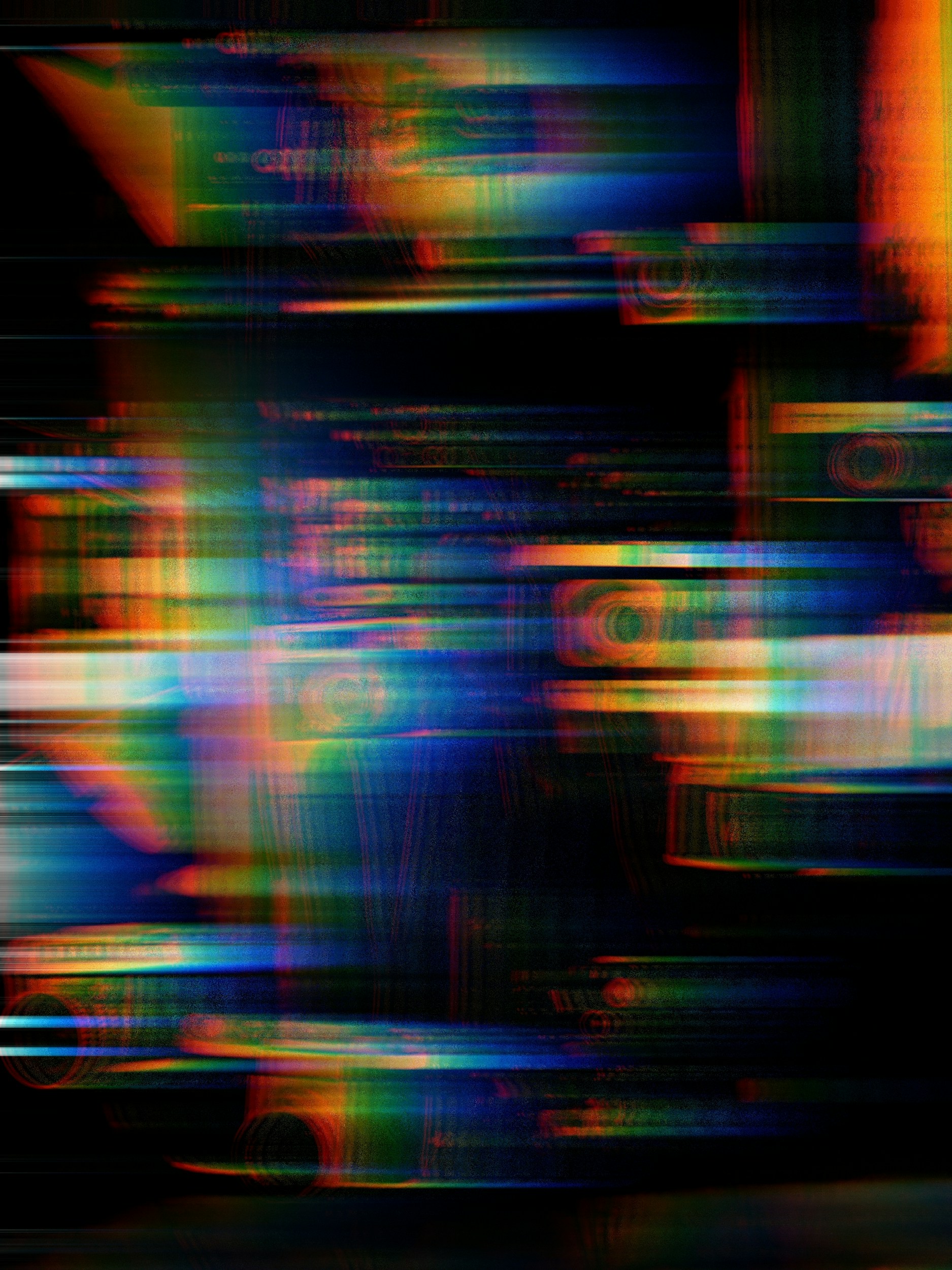
From visual noise → digital rhythmEarly versions leaned too noisy and “glitchy.” I refined the system into a subtler signal language—micro-pulses, breathing interference, and intentional flicker that reads as premium rather than aggressive.
From abstract → organic anchorsWe moved away from pure abstraction and added recognizable, realistic elements as emotional anchors—less “tech for tech’s sake,” more meaning per frame.
From UI frames → cinematic atmosphereInitial compositions felt like screens inside screens. We evolved toward spacious, cinematic layouts with a consistent structure that scaled across content and localization—clarity without losing atmosphere.
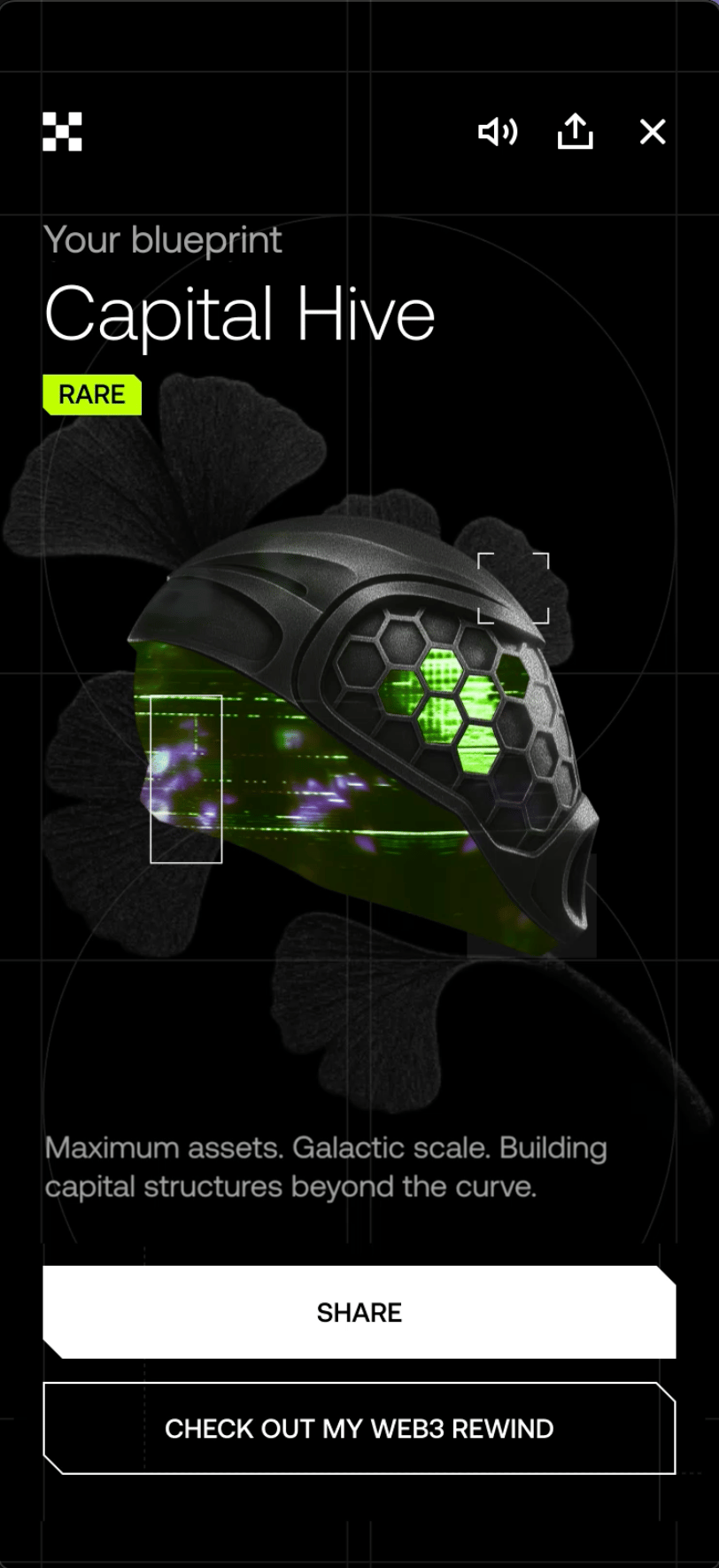
Personas: from abstract geometry → “robot system” identity
I redesigned personas as a recognizable system: still high-tech in logic, but with distinct silhouettes, behaviors, and visual signatures. The goal was identity tokens users could remember instantly and feel proud to share.
I built the persona approach as a scalable framework, not a one-off illustration set—so it could expand without losing coherence.

Creative thesis
We didn’t want to tell users only what they did. We wanted the recap to suggest who they became through a year of decisions: risk, discipline, curiosity, growth. That framing anchored the design language:
Data → motion & signal (activity becomes energy)
Nature → growth & emotion (progress becomes a living cycle)
Tech → architecture & intelligence (the system feels precise, intentional)
This wasn’t a moodboard exercise—it became a decision filter. If an element didn’t strengthen “identity through data,” it didn’t belong.
Cultural & artistic references
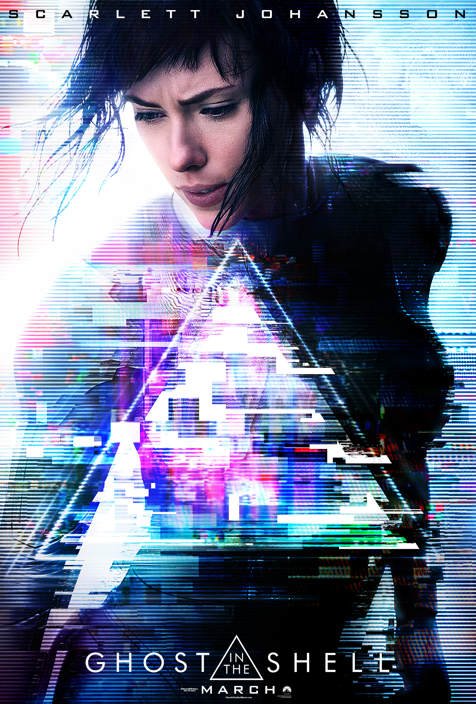
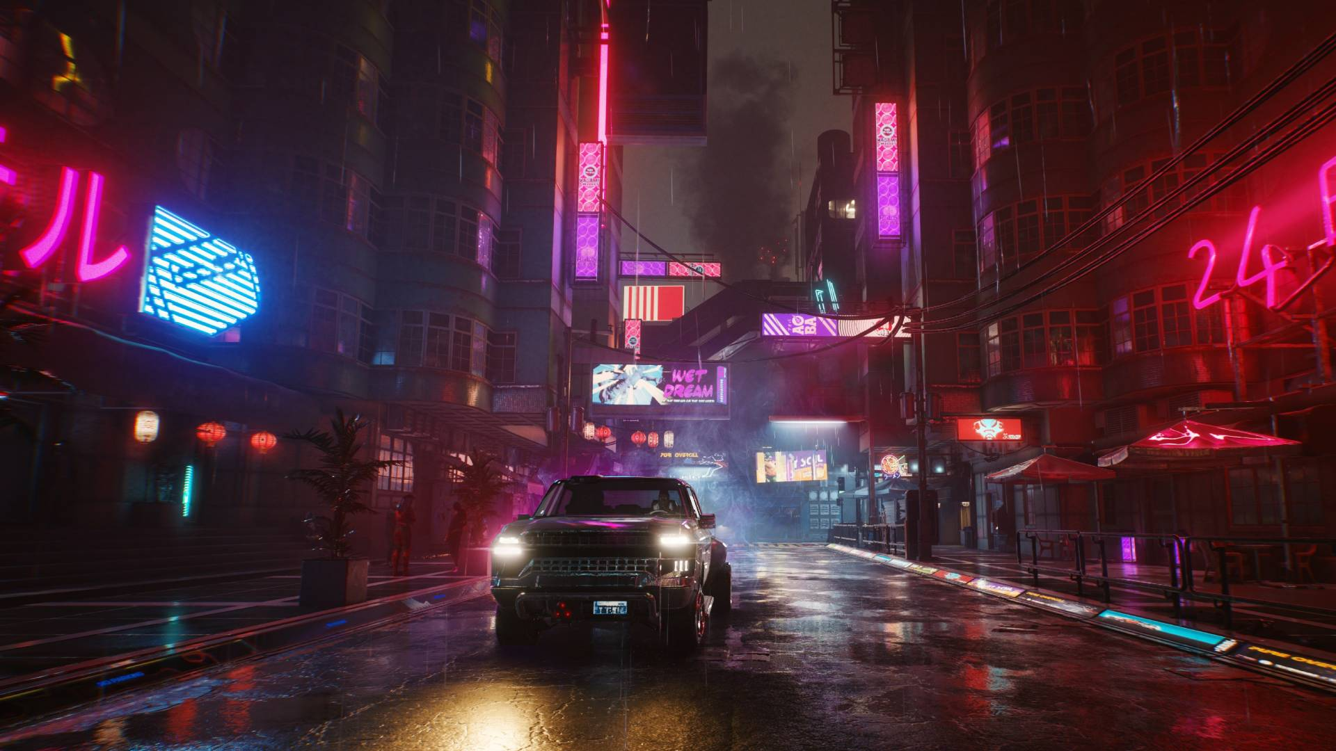
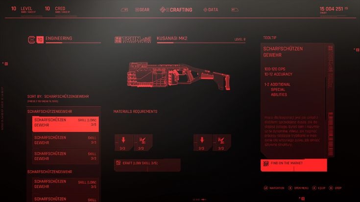
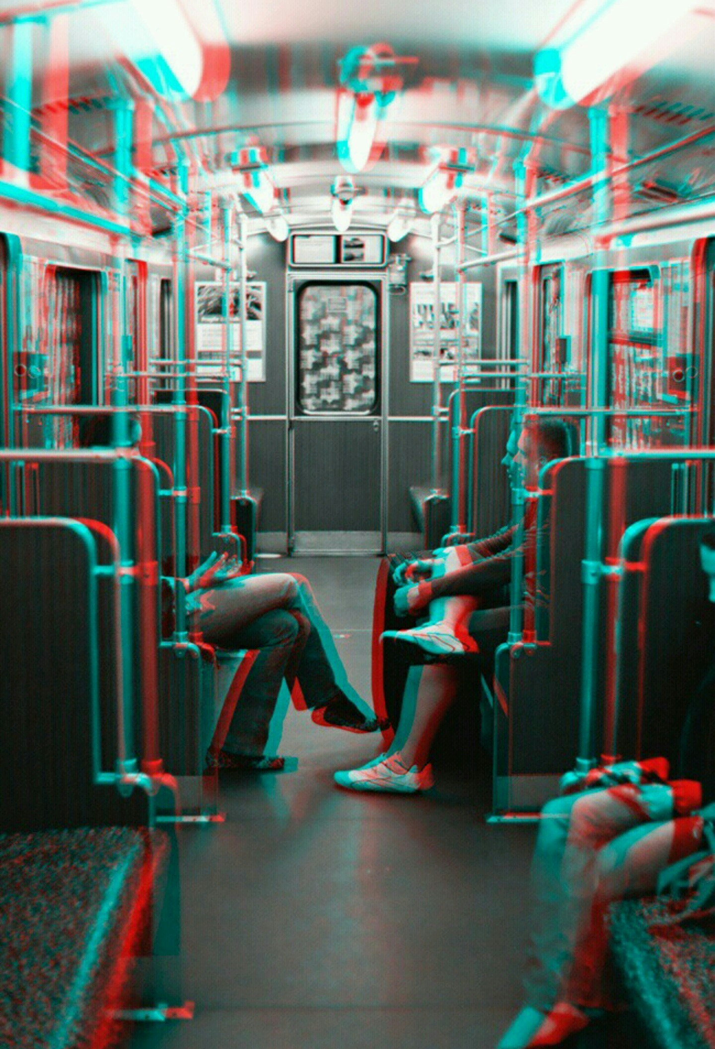
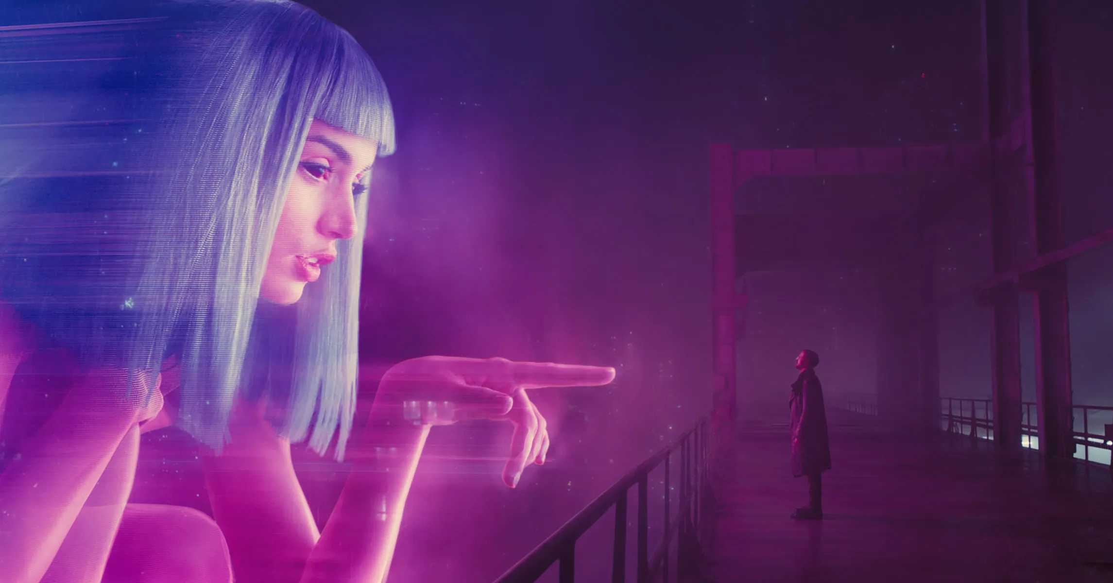
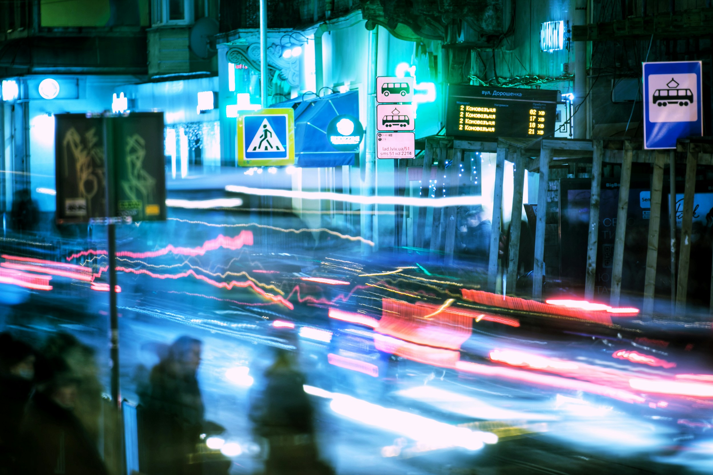
I pulled from digital nostalgia, glitch/signal aesthetics, surveillance UI language, and tech-noir/cyberpunk media (e.g., Blade Runner, Ghost in the Shell, Cyberpunk 2077). I wanted to reference cyberpunk culture for its visual grammar of signal, ambiguity, and intelligence.
Final direction:
“Organic Tech-Noir”
A hybrid language where organic forms (sprouts, flowers, planets, growth cycles) merge with digital overlays (glitch bands, RGB noise, typographic fragments, system schematics). The intent: calm, cinematic, premium—yet alive.
Visual pillars
- Organic core
- Monochrome photography
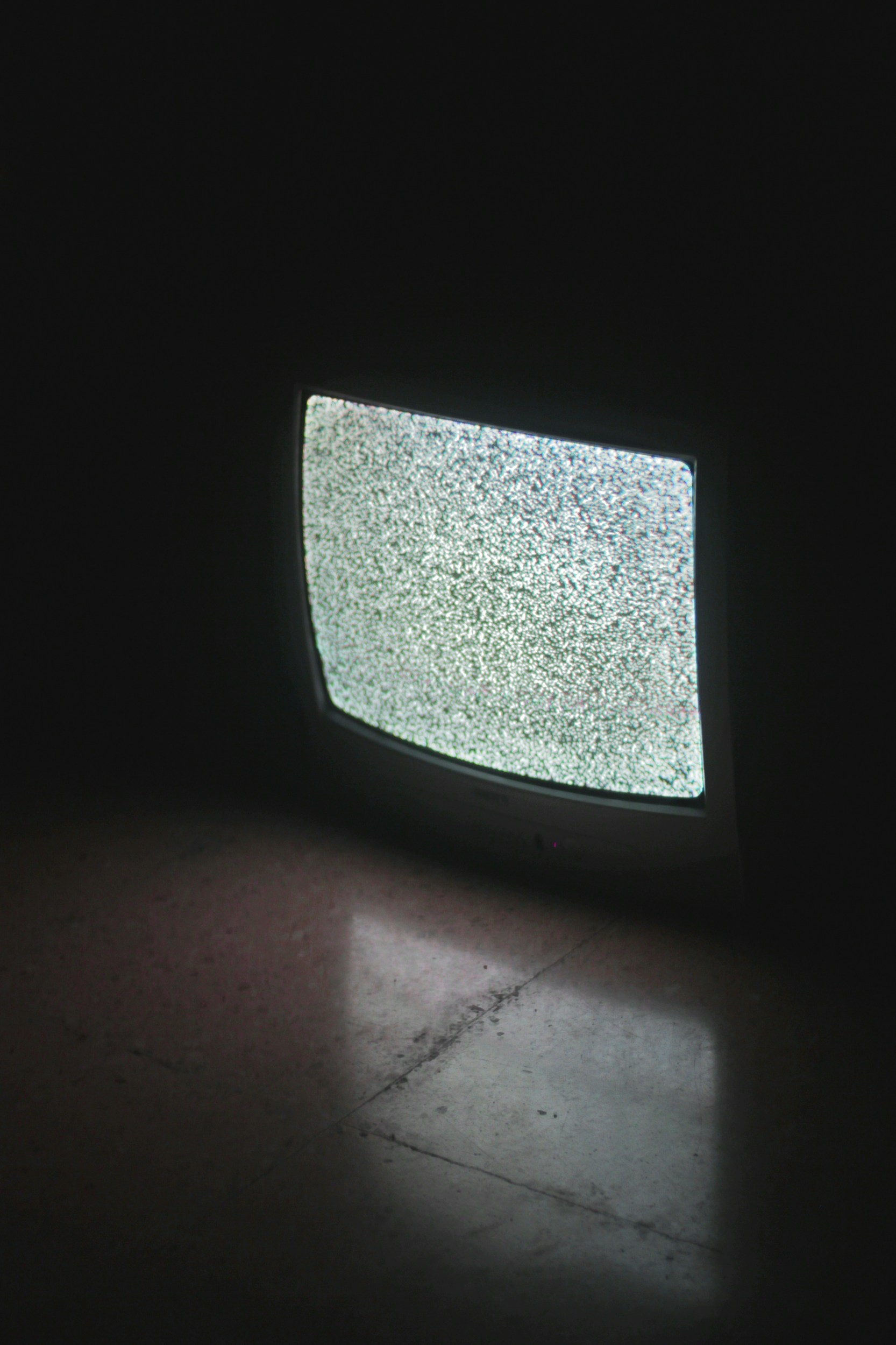
- Tactile textures treated with controlled noise
- Nature as metaphor for cycles, growth, and memory
- Digital overlay
- Signal-based interference
- RGB splits
- Code fragments, schematic marks—data translated into a visual “broadcast”
- Atmospheric composition
- Clean, asymmetric layouts
- Diagonal energy paths and blueprint-like structure
- Cinematic depth, controlled chaos
- Tone & emotion
- Calm but intelligent.
- Poetic but precise.
- Reflective but not static.
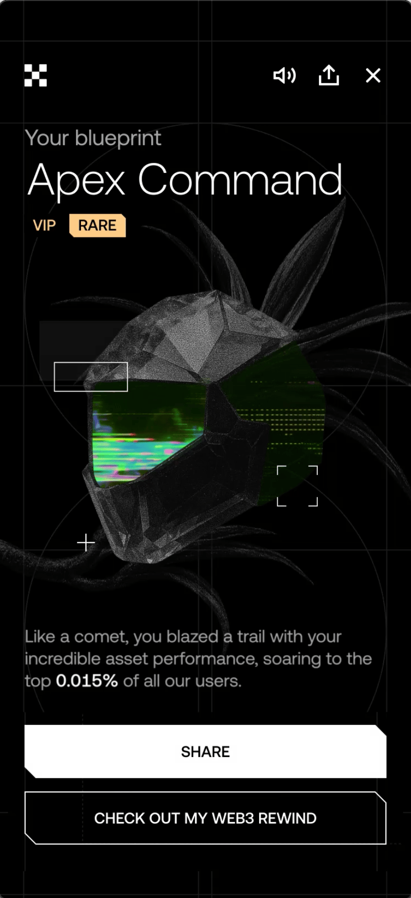
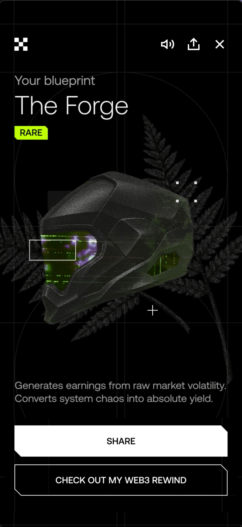
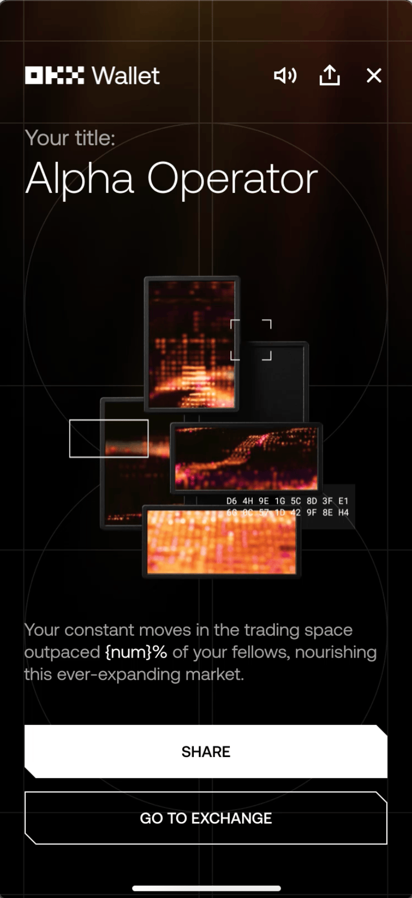
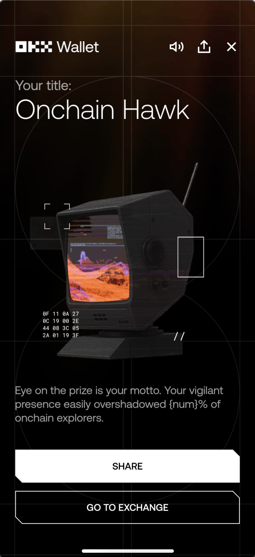
Two products, two dialects:
CeFi vs Web3
Rather than forcing one style across very different mindsets, I formalized a shared system with two dialects:
CeFi (OKX app):
- organic stability
- structured intelligence
- calm premium confidence
Web3 (OKX Wallet):
- frontier energy
- exploration
- space-forward cues
Same design DNA, different emotional register, so each product feels native while still unmistakably OKX.
Motion design:
making the system breathe
Motion was more than decoration; it was narrative.
We used movement to translate “data as signal” into feeling:
- micro-pulse chromatic interference
- subtle breathing glitches
- flickering typographic/code fragments
- restrained transitions that maintain performance safety
AI-assisted workflow:
acceleration without losing authorship
AI supported the craft layer not as a replacement, but as acceleration:
- rapid concept ideation
- texture variation generation
- style tests and compositional exploration
This reduced iteration cycles and expanded exploration range, allowing more time to refine narrative clarity, system consistency, and taste. Creative direction and judgment stayed human; AI simply widened the sandbox.
Cross-functional collaboration
This project only works when design and product move together:
- Product design: experience flow, pacing, share moments
- PM: prioritization, incentives, alignment on what drives sharing
- Content design: narrative tone to match the visuals—poetic but precise
- Engineering: feasibility, localization readiness, motion performance, QA
We avoided a “design → handoff” model and built the system together.
Localization & scalability
Crypto Rewind shipped across markets, languages, devices, and OS variations. We designed layouts and typographic logic to maintain clarity under expansion so that the experience stayed premium everywhere, not just in English.
When design moves the needle
How strong visual direction translated into real engagement, praise, and measurable growth
Impact
1M+ visits
30K+ social shares
0 negative comments on socials
Why it worked
Emotional anchor
identity-driven framing made the recap feel personal, not statistical
Recognizable persona system
users had a visual “badge” worth sharing
Premium, on-trend language
mature tech-noir without gimmicks
Craft + restraint
cinematic and alive, but readable, performant, and scalable
Share mechanics aligned with meaning
users shared because it said something about them
Beyond Rewind
What I learned—and how this project can inform future product storytelling
What we learned
—and how this project can inform
future product storytelling
Clarity is necessary, not sufficient.
People share what feels like identity.
Restraint scales.
Premium isn’t loud—it’s controlled, consistent, and intentional.
Systems beat one-offs.
When visual language is modular, you move faster and better next time.
Collaboration is a design tool.
The best outcomes came from shaping constraints together early, not as a one-off delivery.
System value beyond Rewind
- a scalable persona framework usable for achievements, loyalty, onboarding, and milestones
- a signal-based motion language that can unify future storytelling surfaces
- an “Organic Tech-Noir” visual framework adaptable to other OKX narratives
- a modular asset library for faster iteration and consistent quality
- validated share mechanics tied to identity, not just “post this”
Crypto Rewind showed how a data product can become a yearly ritual—when storytelling, systems, and craft are designed as one.