CHA:D
ChA:D streamlines Chello’s bank operations and customer success workflows by consolidating customer data into a single, searchable dashboard and enabling near-instant issue resolution without relying on engineering.
For
Chello (OFG Bancorp)
Time
Jun - Jul 2024
Role
UX Research / UX Design / UI Design / Design System
Type
Desktop / Internal Tool / ToB
When support work depends on engineers,
customers wait
Problem space
Chello supports the finances of small and mid-sized healthcare organizations. Internally, the Bank Operations and Customer Success teams needed to move fast: answer questions, verify customer details, and resolve onboarding issues. But the workflow wasn’t designed for speed.
Two pain points kept repeating:
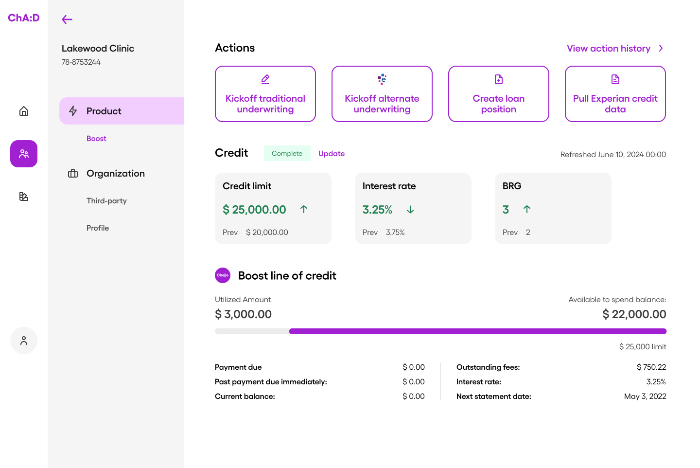
1) Reviewing customer information
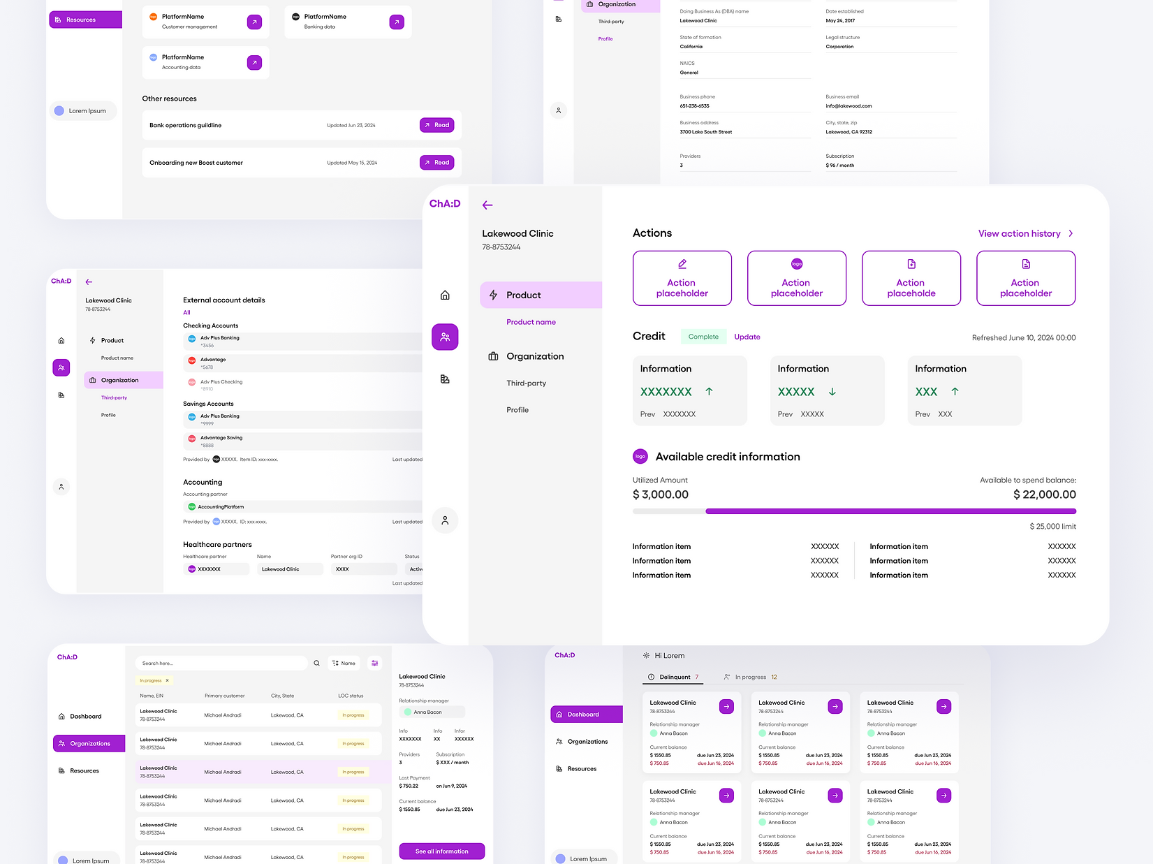
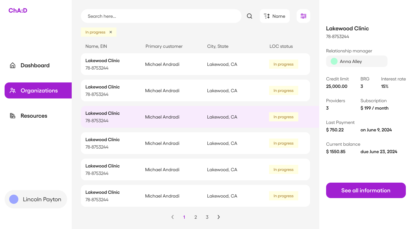
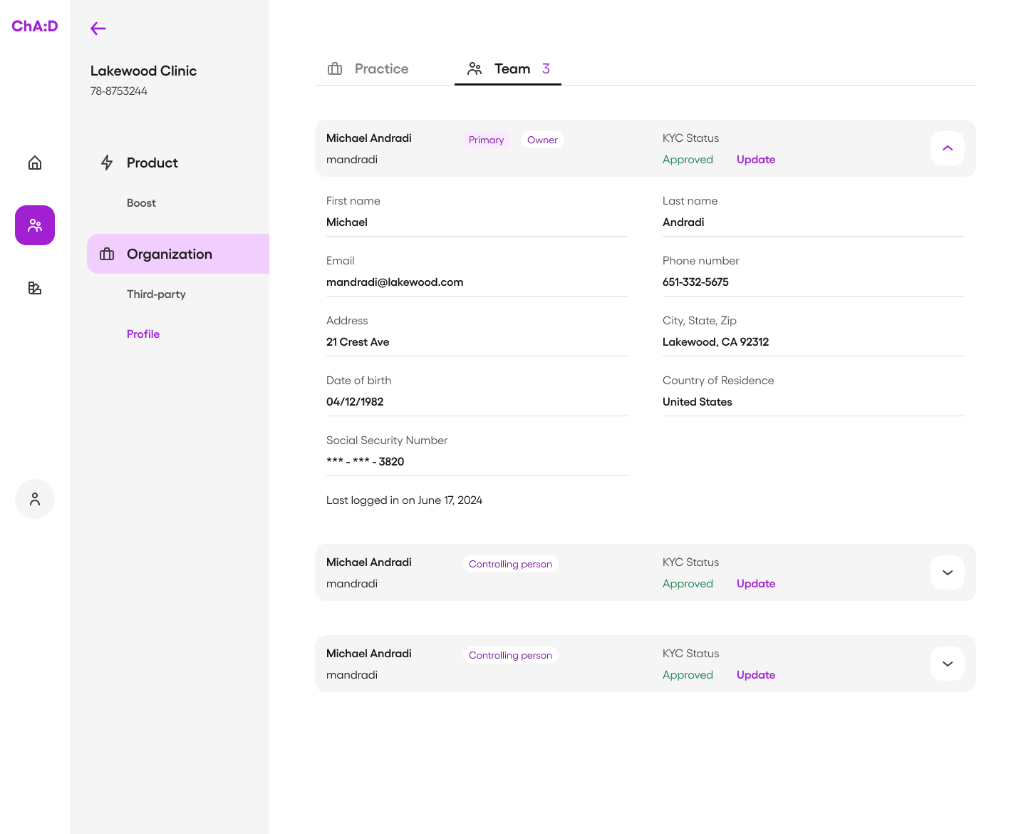
- data was spread across multiple tables and systems
- there was no intuitive UI—mostly raw database views
- retrieving a “360 view” often required technical help and took ~30 minutes
2) Resolving customer issues
- customers had to spot and report errors
- resolution required multiple teams and handoffs
- issue recovery could take 4–6 hours, slowing onboarding and support
The result: internal teams lost time, and customers experienced delays during moments where trust matters most.
Design goal
Build an internal platform that lets non-technical teams find customer data instantly and resolve common issues quickly, without depending on the engineering team.
Requirements first:
designing from real workflows
Because this tool would be used daily by internal teams, I started by grounding the project in tasks, not screens.
What I did
- scheduled interviews with Bank Ops members and the Customer Success manager
- mapped end-to-end tasks and decision points
- documented what information users needed before taking action—and what changed after
- ran lightweight co-design activities to help prioritize frequent and urgent actions
This clarified a key product requirement: the UI needed to reduce cognitive load while handling dense, high-stakes data.
I categorized and structured the information into a clear model, then created a sitemap to define the information architecture. From there, I moved into sketches and early page explorations, focusing on data hierarchy and scanability.
Making dense data readable:
IA + hierarchy as the product
Design strategies
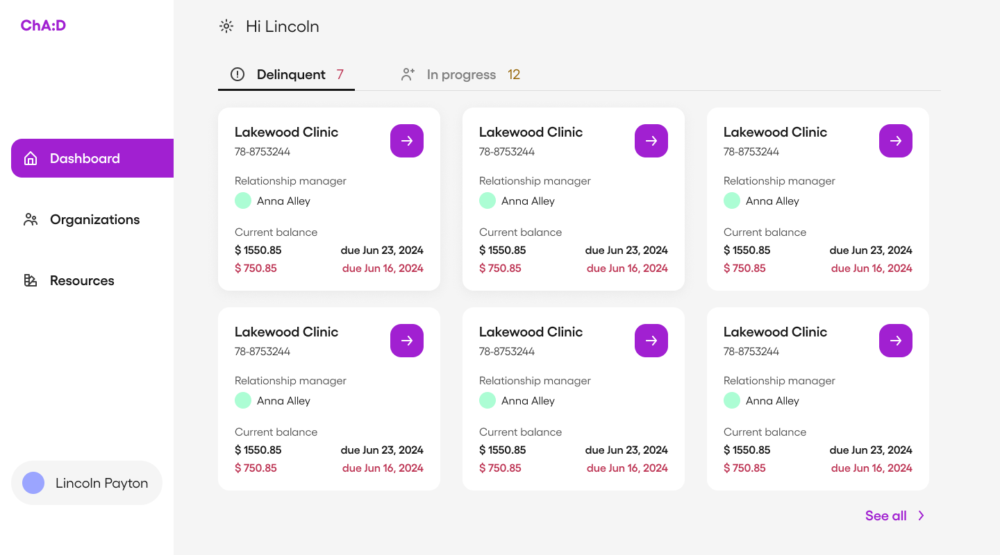
ChA:D is a data-driven platform. The design challenge wasn’t visual polish—it was information legibility. The UI had to help users answer questions quickly:
- “Who is this customer?”
- “What’s their current status?”
- “What changed recently?”
- “What action should I take next?”
Design strategies I used
- Layering without clutterUsed hierarchy through typography, containers, and subtle emphasis to differentiate critical vs. secondary information—without turning the UI into a dashboard maze.
- Chunking for scanningOrganized information using tabs, sections, and whitespace so users could locate what they needed without excessive scrolling.
- Prioritizing actions + outcomesPlaced high-frequency actions and top-level customer signals where users naturally look first, so “search → understand → act” happens fast.
These decisions were validated and iterated through testing with real internal users.
Designing ChA:D as part of the Chello ecosystem
Following the brand
Even though ChA:D is an internal tool, its UI still carries the company’s standards. I reviewed Chello’s brand guidelines and aligned the dashboard’s tone to be:
- friendly, but professional
- concise, but data-rich
- modern, but not visually noisy
I designed both a graphic mark and a wordmark for ChA:D, ensuring it felt like a product within Chello rather than an ad-hoc admin tool.
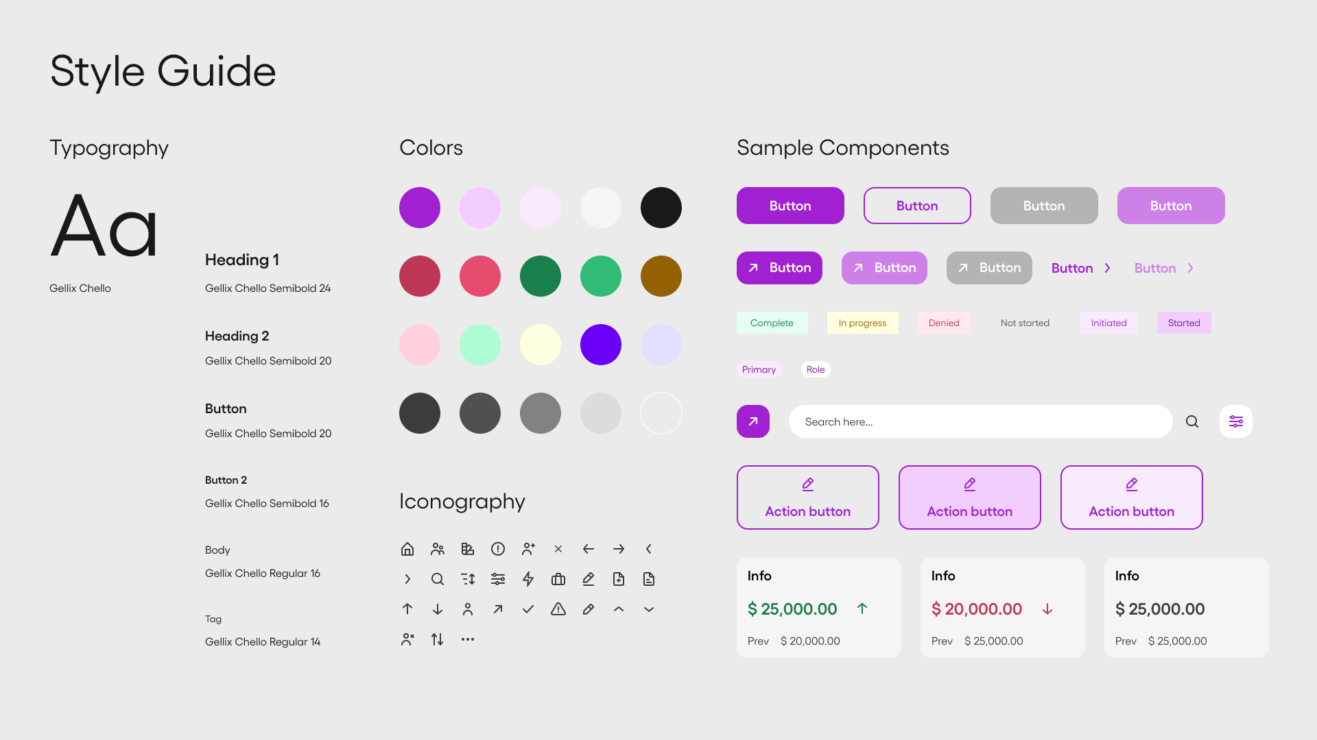
Building a scalable system
To make design and development scalable, I created a design system tailored for a desktop, data-heavy environment:
- color styles and accessible typography
- spacing rules for readability at scale
- reusable, flexible components for tables, navigation, filters, and actions
- organized Figma structure so future designers and engineers could find patterns quickly
This reduced friction for implementation and made future expansion easier—new pages could reuse patterns rather than reinvent structure.
Cross-functional delivery
I worked closely with engineers throughout delivery:
- documented UX/UI and middleware requirements as clear user stories
- joined scrum ceremonies to align on constraints and sequencing
- used Figma Dev Mode to support consistent UI implementation
- collaborated on edge cases where data behavior affected the interface
My engineering background helped me communicate requirements precisely and reduce back-and-forth during build.
Outcomes: measurable speed, clarity, and satisfaction
Impact
After 4 iterations (design → test → refine), I tested the final prototype with the internal teams who would use it.
Impact
- Customer data retrieval: ~30 minutes → ~30 seconds
- Issue recovery time: 4–6 hours → ~30 seconds
- Usability score: 29.375 → 87.5
- Strong qualitative feedback from Customer Success, Bank Ops leadership, Engineering, and Product
ChA:D’s expected business impact extends beyond speed: faster operations and smoother onboarding translate into better customer satisfaction, as well as stronger retention and acquisition as Chello grows.
What I learned
This project sharpened how I design for real-world constraints: internal tools succeed when they reduce friction quietly and consistently.
Key takeaways I carried forward:
- start from workflows and decision points, not UI patterns
- in data-heavy products, hierarchy is the experience
- design systems are not deliverables—they are operating leverage
- the best handoff is building alongside engineering from day one
ChA:D remains a strong example of how product design can directly unlock operational efficiency and improve customer experience, even when the user is internal.